Schedule Pro logo Schedule Pro

S-Curve & Histogram

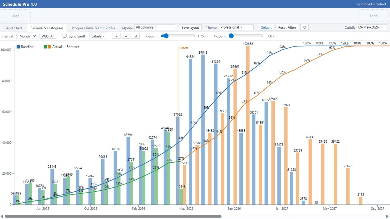
Time-phased cumulative curves and period histograms for units or cost, comparing baseline, actual and forecast around a single cut-off date.
📘 Get Manual

See it in action

Schedule Pro S-Curve with period histogram in Power BI

Abilities & formatting

Baseline, actual & forecast curves

Three cumulative S-curves on one chart, on a percent or value axis.

How: curves are computed from the schedule; toggle each series and set its color.

Period histogram

Per-period workload bars paired beneath the curve, with a combined cumulative line.

How: bars follow the chosen day / week / month grouping.

Units ⇄ Cost toggle

Switch the whole chart between labor units and cost.

How: the Units / Cost toggle in the toolbar.

Cut-off split

The cut-off date separates actual (≤ cut-off) from forecast (> cut-off).

How: set the cut-off; the curves split at that point.

Resource-type filter

Focus the curve and bars on selected resource types.

How: pick the types to include from the filter.

Adjustable date axis

Tune the x-axis date density and format to match your reporting calendar.

How: Format ▸ axis density and date format.